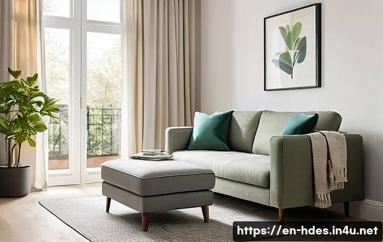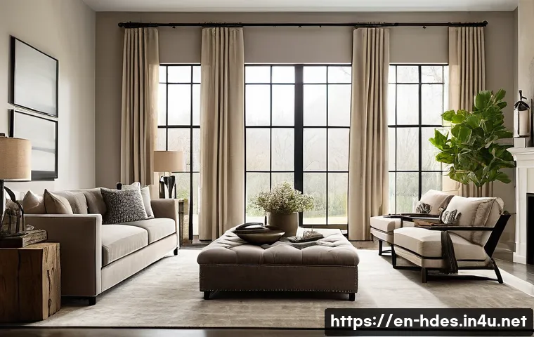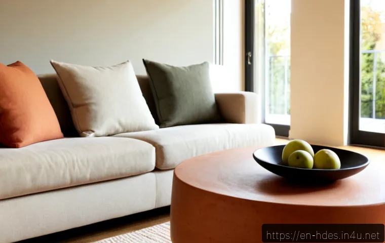
Match wall paint, furniture, flooring, and lighting with a simple color plan. Learn reliable color ratios, undertone checks, room-specific palettes, and when a color consultation can save money.
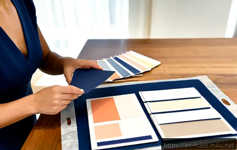
Match interior colors by starting with fixed finishes, checking undertones in real light, and testing samples before purchasing large items. A simple 60-30-10 plan helps coordinate walls, furniture, flooring, and accents without making the room look overly designed.
This approach is especially useful when comparing paint options, lighting, furniture, or a color consultation service. The goal is not to find one universally “perfect” shade, but to make choices that work together in your specific room.
Paint chips are useful for narrowing options, but larger samples reveal how color behaves beside your flooring, fabrics, and lighting. If the project includes expensive finishes or an open-plan layout, professional interior design services may provide useful direction before you commit.
At a Glance
- Start with fixed finishes such as flooring, tile, countertops, cabinets, and large upholstery.
- Test samples in your actual room in morning, afternoon, and evening light before choosing paint.
- Buy large items last after confirming the palette with real materials, not a screen alone.
| Option | Best For | What to Check Before Choosing |
|---|---|---|
| Paint swatches | Narrowing down a broad color direction | Undertones, nearby finishes, and how the chip looks away from store lighting |
| Peel-and-stick samples | Seeing a larger color area without painting a wall | Placement near windows, cabinetry, furniture, and different light sources |
| Sample pots | Final paint decisions and sheen comparisons | How the paint appears on a larger surface at different times of day |
| Digital room planners | Testing general palette ideas and furniture arrangements | Whether screen colors are verified with physical samples afterward |
| Color consultation services | Open-plan rooms, renovations, or costly furniture purchases | Consultation scope, deliverables, and whether fixed finishes are included |
Start With the Colors You Cannot Easily Change
The safest color-matching decision begins with what is already difficult or expensive to replace. Flooring, countertops, tile, cabinetry, and large upholstered pieces should guide the palette before wall paint or decorative accents. A wall can be repainted; a countertop or sectional sofa is usually a much bigger commitment.
Identify Fixed Finishes
Walk through the room and list every finish that will stay. Include wood floors, stone, metal hardware, built-in cabinets, backsplash tile, and large rugs or sofas. These materials may look neutral at first, but most carry a visible undertone.
Find the Dominant Undertone
White can lean creamy or cool. Gray can have blue, green, or violet notes. Beige may appear yellow, pink, or gray-based. Wood, stone, and fabric also have undertones that influence the whole room. Match the undertone before the color name; two products called “warm gray” can still clash.
Three Quick Rules for Avoiding a Mismatched Palette
- Do not choose a wall color under store lighting alone.
- Compare samples directly beside flooring, fabric, cabinetry, and metal finishes.
- When unsure, choose a restrained neutral that supports the strongest fixed finish instead of fighting it.
Build a Balanced Palette for Walls, Furniture, and Accents
A color palette works best when every shade has a job. The familiar 60-30-10 guideline is a practical planning tool: use one dominant color, one supporting color, and a smaller accent color. It is a framework, not a rule that must be followed exactly.
Use the 60-30-10 Rule Without Making the Room Feel Formulaic
The dominant color often appears on walls, major flooring, or the largest furniture pieces. The secondary color can appear in curtains, a rug, chairs, or bedding. Accent color belongs in smaller details such as cushions, artwork, lampshades, or decorative objects. Texture can create variety even when the palette is quiet.
Choose a Dominant Neutral, Supporting Color, and Accent Color
Start with a neutral that agrees with the room’s fixed finishes. Then select a supporting shade that adds depth without changing the room’s overall temperature. Use the accent sparingly. A strong accent is easier to replace than a brightly painted room or a large furniture purchase.
When Different Color Schemes Work Best
Monochromatic schemes use variations of one color and can feel calm and connected. Analogous schemes use nearby colors and suit rooms that need gentle contrast. Complementary schemes use opposite colors and create more energy, so they often work best when one side is kept muted.
Compare Paint Samples, Lighting, and Color-Planning Options
Color is not fixed. It changes with daylight direction, time of day, bulb temperature, sheen, and nearby materials. A reliable purchase decision needs more than a paint card or a digital visualizer.
Paint Swatches, Peel-and-Stick Samples, and Sample Pots
Swatches help you eliminate obvious mismatches. Peel-and-stick samples offer a larger viewing area and can be moved around the room. Sample pots allow you to see the real paint and finish on the wall. For a final wall color, physical testing is usually the most useful step.
Check Morning, Afternoon, and Evening Light
View samples in more than one condition. Warm light can enhance yellow, red, and orange undertones, while cool light can emphasize blue and gray undertones. Place samples near windows, dark corners, lamps, and the finishes that must remain.
When Digital Visualizers Help
Room-planning tools can help compare broad paint color directions, furniture placement, and general interior color schemes. They are less dependable for final undertone decisions because screens vary. Use a visualizer to create a shortlist, then confirm it with real samples.
The Value of a Color Consultation
A color consultation can be worth comparing when a project includes multiple connected rooms, permanent finishes, custom cabinetry, or expensive furniture. Before booking, check whether the service reviews lighting, existing materials, paint finishes, and a written palette. Compare the consultation scope rather than assuming every interior design package offers the same help.
Avoid Expensive Matching Mistakes Before You Purchase
The most costly color mistakes often happen when decisions are made in isolation. A paint color may look appealing by itself but fail beside a warm floor, a cool countertop, or a sofa with a hidden green undertone.
Do Not Select Paint Under Store Lighting Alone
Bring the likely choices home. Large painted surfaces often look stronger or darker than a small chip suggests, especially in rooms with limited daylight.

Test More Than Paint
Place samples beside fabric, wood, metal, stone, and tile. If you are buying curtains, rugs, or furniture, request or inspect material samples where possible before committing. This step can reduce avoidable return shipping and repainting.
Consider Sheen and Practical Use
Matte, eggshell, satin, and gloss finishes reflect light differently, changing the perceived depth of a color. Compare the finish as well as the shade. Consider how visible marks, reflected light, and future touch-ups may matter in that room.
Room-by-Room Color Matching Tips
Living Rooms: Comfort and Flexibility
Living rooms often contain varied fabrics, wood tones, and lighting. Start with the largest upholstery and flooring, then use a flexible wall color that does not compete with them. Keep high-contrast accents removable through cushions, artwork, or smaller decor.
Kitchens: Work Around Cabinets and Surfaces
Kitchen paint should connect cabinetry, counters, backsplash materials, and hardware. Test wall samples vertically beside these surfaces, not only on an empty wall. If several fixed finishes compete, choose the wall color that supports the most dominant material.
Bedrooms: Favor Low-Contrast Layers
For a calmer bedroom, use related tones across wall paint, bedding, curtains, and rugs. Low contrast does not mean one flat color; mix texture and finish to keep the space from feeling dull.
Small Rooms and Hallways: Use Contrast Thoughtfully
Small rooms can handle either a light, connected palette or a deliberate deeper shade. What matters is how the choice behaves with available light and adjoining rooms. Test samples near doorways so transitions do not feel accidental.
Selection Criteria and Comparison Summary
Before purchasing paint, rugs, curtains, lighting, or furniture, check these points:
- Fixed finishes: Does the choice agree with the undertones in flooring, cabinetry, tile, and countertops?
- Real lighting: Has it been viewed in daylight and under the bulbs used in the room?
- Sample method: Is a swatch enough, or does the decision require a peel-and-stick sample or sample pot?
- Purchase flexibility: Compare sample costs, return policies, and consultation scope before committing.
- Project risk: Use DIY testing for simple updates; compare color consultation or interior design services for connected spaces and major renovations.
For paint brands, room-planning tools, lighting, or color consultation services, review the official details and current conditions on the relevant provider page before making a purchase.
Final Thoughts
Good interior color matching is less about finding a trendy shade and more about seeing the entire room as a system. Begin with the finishes you cannot easily change, identify undertones, and test real samples under real light. Use the 60-30-10 guideline as a starting point, then adjust it for your room and preferences. A slower decision process before purchase can make the final space feel more cohesive.
Useful Things to Know
1. A paint color can shift noticeably from one wall to another because light exposure changes.
2. Warm and cool bulbs may reveal different undertones in the same paint color.
3. A finish sheen can make the same color appear deeper, lighter, or more reflective.
4. Renters should check lease terms before repainting or changing permanent finishes.
Important Notes
No paint color can be confirmed for every home without reviewing its lighting, fixed finishes, and furnishings. Paint formulas, local stock, pricing, furniture availability, and consultation costs can vary by location and provider. Always verify current product details, return terms, and service inclusions before ordering.
Frequently Asked Questions
Q1. What is the easiest way to match wall paint with existing furniture and flooring?
A1. Start with the furniture and flooring that will remain, then identify whether their undertones are warm, cool, or mixed. Test a few wall-color samples beside those materials in daylight and artificial light. Choose the option that supports the existing finishes rather than trying to match every color exactly.
Q2. Is a professional color consultation worth the cost for one room?
A2. It may be useful when the room has costly fixed finishes, complicated lighting, or several connected spaces. For a straightforward room with flexible furnishings, physical paint samples and a simple palette plan may be enough. Compare what each consultation includes before deciding.
Q3. Should I choose paint color before buying a sofa, rug, or curtains?
A3. Consider fixed finishes first, then choose major furniture and textiles when possible. Paint is generally easier to adjust than a large sofa or a custom rug. Once the largest materials are selected, test wall colors against them before making the final paint purchase.